Minimalist Mobile App Design: Why Simpler Works
Minimalist mobile app design improves usability by keeping interfaces simple and clean. It removes clutter, speeds up navigation, and helps users complete tasks easily. This improves engagement and user satisfaction.
 Babar Al-Amin

Minimalist mobile app design focuses on simplicity, improving usability, and enhancing overall digital user experience today. Modern mobile users prefer clean interfaces because cluttered screens reduce engagement and significantly increase cognitive load.
Minimalist design improves navigation speed, helping users complete tasks faster with fewer distractions overall today. Apps with simplified interfaces often achieve higher retention rates because users find them intuitive and easy enough.
As mobile ecosystems grow, simplicity remains a key factor driving usability, satisfaction, and long-term adoption success. In this article, we will explore how minimalist mobile app design works and why it delivers better results. Let’s dive in.
Key Takeaways
- Minimalist mobile app design focuses on simplicity and clear functionality
- Reducing clutter improves user experience and makes navigation easier
- Lower cognitive load helps users complete tasks faster and with less effort
- Strong visual hierarchy guides users to the most important actions quickly
- Consistency across screens builds familiarity and reduces user confusion
- Simpler interfaces increase engagement, retention, and overall app satisfaction
- Avoiding unnecessary elements leads to faster, more efficient mobile interactions
What Is Minimalist Mobile App Design?
Minimalist mobile app design is a UI/UX approach that focuses on simplicity, clarity, and functionality by removing unnecessary visual elements. It ensures that every screen contains only essential features, helping users interact with apps more efficiently and without confusion.
Minimalism improves usability by reducing visual clutter and making navigation more intuitive for mobile users. This design approach is not about making apps empty, but about making them purposeful.
Designers carefully choose typography, spacing, and color to guide attention toward key actions. Clean layouts, limited color palettes, and strong visual hierarchy are core components of this style.
Minimalist interfaces improve task performance and reduce cognitive load by helping users process information faster and with less effort.
In mobile apps, where screen space is limited, this approach is especially powerful because it enhances usability, speeds up interactions, and improves overall user satisfaction.
Read More: Mobile App Trends Businesses Should Plan
Core Principles of Minimalist Mobile App Design
Minimalist mobile app design is based on removing unnecessary complexity and focusing only on what truly improves user experience. Each principle works together to create faster, clearer, and more intuitive mobile interactions.
Simplicity with Clear Purpose
Simplicity means designing each screen around a single clear goal. Instead of overwhelming users with multiple actions, the interface highlights what matters most. This helps users focus better, reduces confusion, and makes app interactions feel more natural and direct.
Reducing Cognitive Load
Mobile users prefer apps that require minimal thinking effort. When too many elements compete for attention, decision-making slows down. Minimalist design reduces this mental effort by presenting only essential information, allowing users to complete tasks more smoothly and efficiently.
Strong Visual Hierarchy
Visual hierarchy guides users through the interface without confusion. Designers use size, contrast, spacing, and typography to show what is most important. This helps users immediately understand where to look and what action to take next, improving overall usability.
Consistency Across the Interface
Consistency helps users build familiarity with the app. When buttons, icons, colors, and navigation patterns remain consistent across screens, users learn the system faster. This reduces mistakes and creates a more predictable and comfortable experience.
Functional-Only Design
Minimalist apps avoid unnecessary decoration and focus only on useful elements. Every component must have a clear purpose. Removing non-essential visuals improves speed, reduces distraction, and ensures users can complete tasks without interruption.
Why Simpler Works in Mobile App Design
Simplicity works in mobile app design because it aligns with how users naturally interact with small screens under time pressure. Mobile users typically scan interfaces quickly rather than reading every element, so clarity becomes essential for smooth interaction.
Minimal interfaces reduce decision fatigue. When users are presented with fewer choices at a time, they can make decisions faster and with more confidence. This improves task completion and reduces the chance of users abandoning an app midway.
Simpler designs also improve perceived speed. Even if an app loads at the same technical speed, a clean interface feels faster because users can immediately understand where to go and what to do next. This creates a smoother and more satisfying experience.
Another important reason simplicity works is that it reduces cognitive overload. Mobile screens that are crowded with text, buttons, or visuals force users to process too much information at once. A minimalist layout removes this strain and allows users to focus only on meaningful actions.
Engagement also increases when distractions are minimized. Users are more likely to stay in an app when their attention is guided toward a single clear objective rather than pulled in multiple directions. This leads to better retention and more consistent usage over time.
Ultimately, simpler mobile app design works because it respects user attention, reduces friction, and makes digital interactions feel effortless.
Key Elements of Minimalist Mobile App UI
Minimalist mobile app UI is built using a few essential design elements that work together to create clarity, speed, and ease of use. Each element is intentionally simplified to improve how users interact with the app on small screens.
Typography-Driven Layouts
Typography plays a central role in minimalist apps. Clean, readable fonts are used to communicate information clearly without relying heavily on graphics. Proper font sizing and spacing help users scan content quickly and understand information with minimal effort.
Limited Color Palettes
Minimalist interfaces typically use a small set of colors to avoid visual overload. Often, one primary color is used for key actions, while neutral tones support readability and structure. This helps users instantly recognize important buttons and interactive elements.
White Space for Clarity
White space, or negative space, is a critical part of minimalist UI. It separates elements and prevents screens from feeling crowded. This spacing improves focus and makes the interface feel more organized and breathable.
Simple and Clear Icons
Icons in minimalist apps are designed to be easily recognizable and universally understandable. Instead of detailed illustrations, simple line-based or solid icons are used to communicate actions quickly without requiring extra explanation.
Focused Content Blocks
Information is grouped into small, digestible sections rather than long, dense screens. This structure helps users process content step by step and reduces the feeling of being overwhelmed.
Streamlined Navigation
Navigation is kept simple with clear paths and minimal layers. Most minimalist apps avoid complex menus and instead guide users through intuitive gestures or bottom navigation systems for faster access.
Minimalism vs Cluttered Mobile App Design
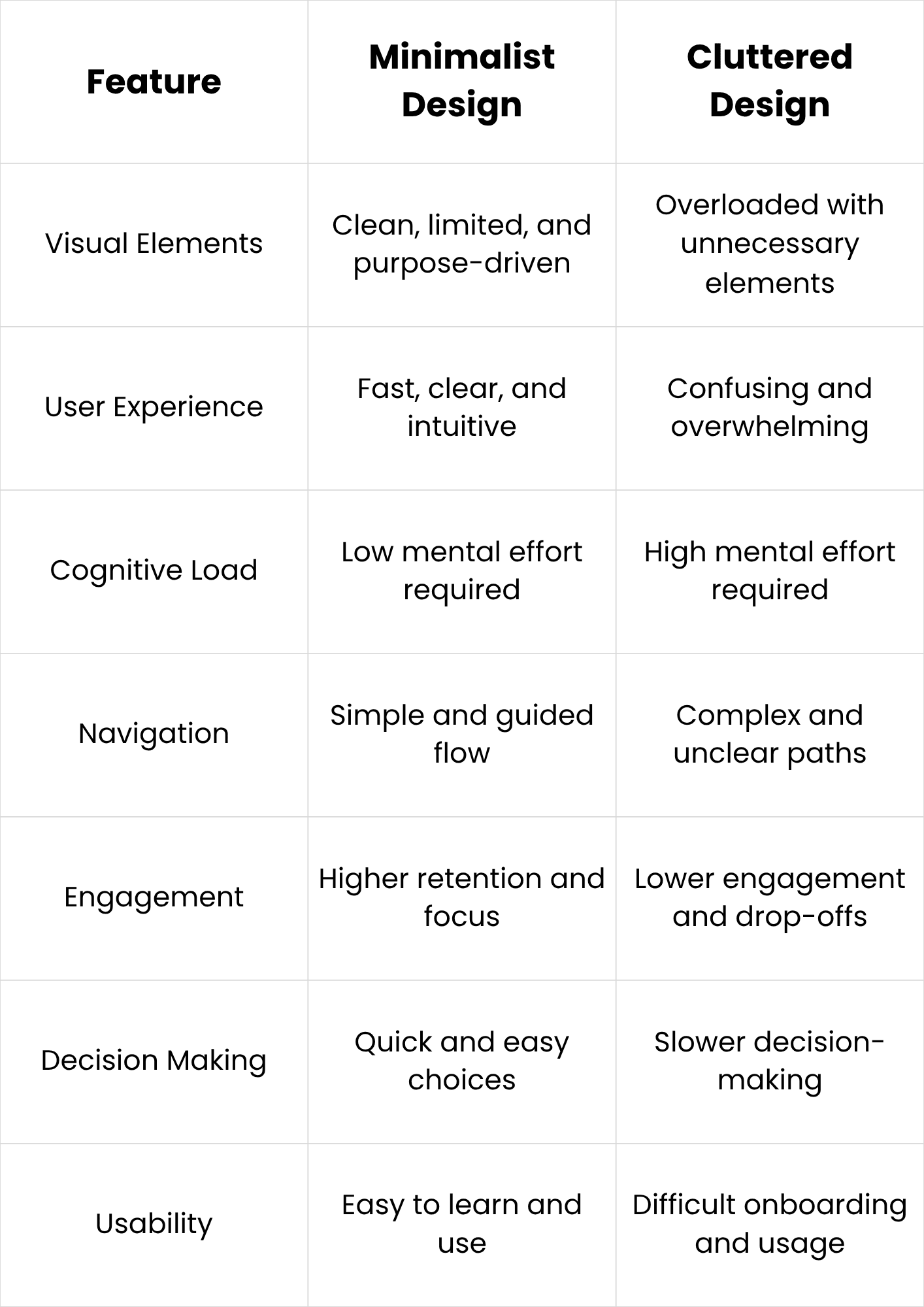
Cluttered mobile app design overwhelms users with excessive buttons, colors, text, and visual elements on limited screen space. This makes navigation confusing and increases the time needed to understand basic actions. Users often feel distracted and uncertain about where to tap or what to do next, which reduces overall engagement and satisfaction significantly.
Minimalist mobile app design removes unnecessary elements and focuses only on essential features and actions. This creates a clean and structured interface that helps users quickly understand the app flow. It reduces confusion, improves navigation speed, and allows users to complete tasks with less effort and more confidence.
Overall, minimalist design improves usability, clarity, and user satisfaction, while cluttered design increases cognitive load, slows interaction, and reduces retention in mobile applications.
Common Mistakes in Minimalist Mobile App Design
- Removing too many elements and making the app confusing instead of simple
- Focusing on aesthetics over usability, leading to poor user experience
- Ignoring clear visual hierarchy, making it hard for users to find key actions
- Using too little information, which leaves users unsure about what to do next
- Overusing white space without balancing structure and content placement
- Designing unclear navigation that hides important features or settings
- Relying only on minimal visuals without supporting user guidance or labels
- Using inconsistent icons, buttons, or spacing across different screens
- Prioritizing style trends instead of real user needs and behavior patterns
- Failing to test usability, resulting in design choices that don’t work in real usage
Want to Build a Mobile App That Feels Simple, Fast, and Effortless?
Ever wondered why some mobile apps feel instantly intuitive while others overwhelm users with clutter and confusion? At WorkersLab, we specialize in developing mobile applications that follow minimalist design principles—focused on clarity, speed, and real user behavior.
Instead of overloading apps with unnecessary features, we design and develop solutions that prioritize what truly matters: smooth navigation, clean interfaces, and purposeful functionality.
Our approach to mobile app development emphasizes removing friction at every step. From UI/UX design to final deployment, we ensure every screen serves a clear function, helping users complete actions faster and with less cognitive effort. This aligns directly with modern mobile expectations where simplicity directly improves engagement and retention.
Whether you're building a startup app or scaling an existing product, WorkersLab helps you turn complex ideas into clean, high-performing mobile experiences that users actually enjoy using.
Want to build a minimalist mobile app that stands out in a crowded market? Contact us today and bring your idea to life today.
Conclusion
Minimalist mobile app design improves usability by removing unnecessary elements and focusing on clarity and function. It reduces cognitive load, speeds up navigation, and enhances user satisfaction. Simpler interfaces help users complete tasks more efficiently while increasing engagement and retention. In a mobile-first world, simplicity is not just a trend but a core requirement for successful app experiences overall.